Your website might look fine at first glance, but what happens in the first few seconds when a visitor lands on it? People decide very quickly whether they want to stay or leave. If something feels off, confusing, slow, or untrustworthy, they move on without a second thought. Most of the time, this happens quietly. No feedback. No message. Just lost leads.
Many business owners assume that a lack of inquiries means a lack of traffic. In reality, traffic often exists, but the website experience pushes visitors away. This article walks through the most common website issues that scare off potential leads and explains how to fix them in a practical, human way.
First Impressions Matter More Than You Think
When someone visits your website, they are not reading carefully at first. They are scanning. They are asking simple questions in their mind.
What is this business about? Do they look professional? Can they help me?
If your website does not answer these questions clearly, visitors feel unsure. Uncertainty leads to exits. A strong first impression comes from clear messaging, clean layout, and a sense of confidence.
Common first impression problems
- No clear headline explaining what you do
- Too much text above the fold
- Outdated design or low quality visuals
- Cluttered layout with no visual hierarchy
Your homepage should guide visitors gently, not overwhelm them. Simplicity builds trust.
Confusing Messaging Creates Doubt
If visitors cannot quickly understand your services, they will not take the next step. Vague headlines, internal jargon, or overly clever wording often confuse more than they impress.
Strong websites speak in the language of their audience. They focus on problems, solutions, and outcomes. When messaging is unclear, visitors start guessing. Guessing creates friction.
Signs your messaging may be confusing
- Generic phrases like we deliver innovative solutions
- Long paragraphs without clear structure
- Services explained from your perspective instead of the client’s
- No supporting explanations under main headings
Clear messaging feels calm and confident. It reassures visitors that they are in the right place.
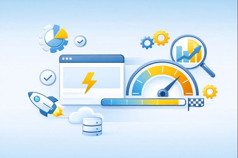
Slow Loading Speed Pushes People Away
Speed is one of the fastest ways to lose leads. If your website takes more than a few seconds to load, visitors leave before seeing your content. This is especially true on mobile devices.
Slow websites feel frustrating. They also feel unreliable. Visitors often associate speed with professionalism, even if they do not realize it consciously.
Common causes of slow websites
- Large, unoptimized images
- Cheap or overloaded hosting
- Too many plugins or scripts
- No caching or performance optimization
A fast website creates a smooth, stress free experience. It shows respect for your visitor’s time and improves search visibility at the same time.
Poor Mobile Experience Costs You Leads
More than half of website traffic now comes from mobile devices. If your website does not work well on a phone, you are losing leads daily.
A poor mobile experience includes tiny text, hard to tap buttons, broken layouts, and slow performance. Visitors should not have to zoom, scroll sideways, or fight the interface.
What a good mobile experience looks like
- Text that is easy to read
- Buttons with comfortable spacing
- Simple navigation
- Fast loading even on slower connections
Mobile friendliness is no longer optional. It is a core requirement for trust and usability.
No Clear Call To Action Leaves Visitors Stuck
Even if visitors like your website, they still need direction. A call to action tells them what to do next. Without it, people hesitate and leave.
Your call to action should be visible, simple, and reassuring. It should feel helpful, not pushy.
Examples of effective calls to action
- Book a free consultation
- Request a quote
- Talk to our team
- Start your project
A strong call to action turns interest into action. It bridges the gap between browsing and contacting you.
Lack of Trust Signals Raises Red Flags
Visitors look for signs that your business is real, experienced, and reliable. When these signals are missing, people feel unsure about reaching out.
Trust signals do not need to be flashy. They need to feel genuine.
Important trust elements
- Real testimonials with names
- Case studies or examples of work
- Clear contact information
- Secure website with SSL
- Professional design and consistent branding
Trust is often built quietly. When it is missing, visitors notice instantly.
Outdated Design Makes Your Business Feel Behind
An outdated website design can make your business look inactive or behind the times. Even if your services are excellent, an old looking website can create doubt.
Modern design does not mean trendy or complicated. It means clean layouts, readable typography, proper spacing, and thoughtful visuals.
A refreshed design shows that your business cares about quality and attention to detail.
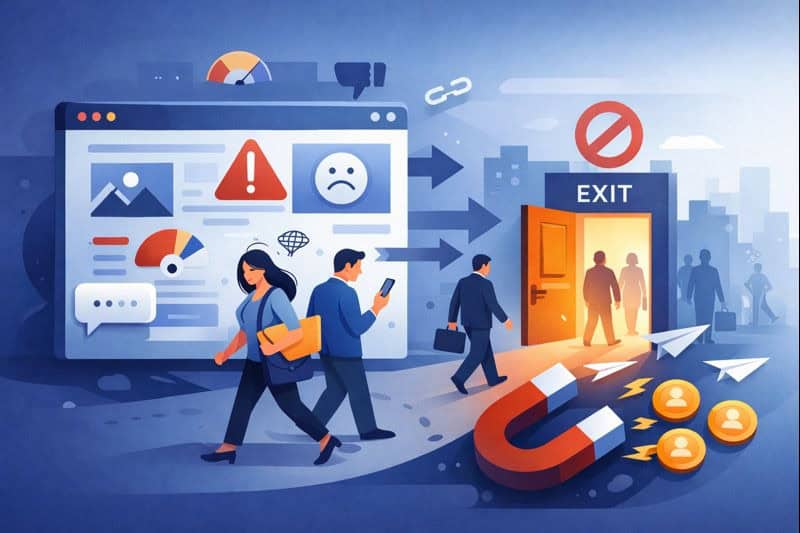
Graphic: Common Website Issues That Scare Off Leads
Visual idea: A simple illustration showing a visitor entering a website and turning away due to issues like slow speed, cluttered layout, unclear messaging, and missing trust signals.
Your Website Should Work For You, Not Against You
Your website should support your business goals, not quietly sabotage them. When visitors feel comfortable, informed, and confident, they are far more likely to reach out.
Your website is often the first interaction potential clients have with your brand. Whether you provide services locally or across Canada, your online presence needs to reflect professionalism and clarity.
At Prestige Digital, we help businesses improve websites that look good, load fast, and convert visitors into real leads. From website design and graphic design to SEO and performance optimization, we focus on building websites that people trust.
If you are wondering whether your website is costing you leads, it might be time for a fresh perspective. A few smart improvements can make a powerful difference.
